Overview of Flutter Button Types with Examples
* Flutter is a popular mobile application development framework that offers developers an easy and efficient way to create high-performance mobile applications.
* One of the most essential components of any mobile application is buttons. Buttons are the primary way users interact with an application, and they play a critical role in user experience.
* Flutter offers a variety of buttons that developers can use to create engaging user interfaces. In this blog, we'll explore the various types of buttons in Flutter and provide examples of how to use them.
- 1. ElevatedButton
- 2. TextButton
- 3. OutlineButton
- 4. IconButton
- 5. FloatingActionButton
- 6. DropdownButton
- 7. Inkwell Button
1. ElevatedButton
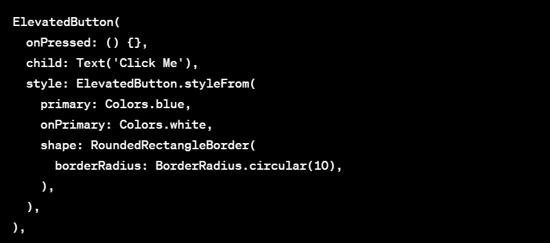
- The ElevatedButton widget is a raised button that provides a bold, colorful look that stands out on the screen. It's great for use in primary actions, such as submitting a form or completing a purchase.
Example usage:
Customize the ElevatedButton Style
- ElevatedButton will use the default button style provided by Material Design. However, we can customize the button style by passing a style object to the style argument.
2. TextButton
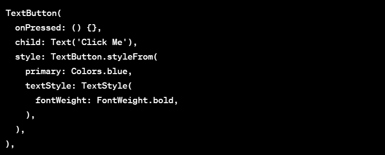
- The TextButton widget is a simple button that provides a flat, text-based appearance. It's great for use in secondary actions, such as cancelling or resetting a form.
Example usage:
Customize the TextButton Style
- a TextButton will use the default button style provided by Material Design. However, we can customize the button style by passing a style object to the style argument.
3. OutlineButton
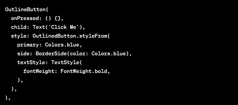
- The OutlineButton widget is a button with an outlined border that provides a subtle, neutral appearance. It's great for use in tertiary actions, such as filtering or sorting.
Example usage:
Customize the OutlineButton Style
- By default, an OutlineButton will use the default button style provided by Material Design. However, we can customize the button style by passing a style object to the style argument.
4. IconButton
- The IconButton widget is a button with an icon as its child. It's great for use in actions that are commonly represented by an icon, such as navigating back or deleting an item.
Example usage:
Customize the IconButton Style
- IconButton will use the default button style provided by Material Design. However, we can customize the button style by passing a style object to the style argument.
5. FloatingActionButton
- The FloatingActionButton widget is a circular button that floats above the content of the screen. It's great for use in primary actions that are commonly used, such as creating a new item or starting a new task.
Example usage:
Customize the FloatingActionButton Style
6. DropdownButton
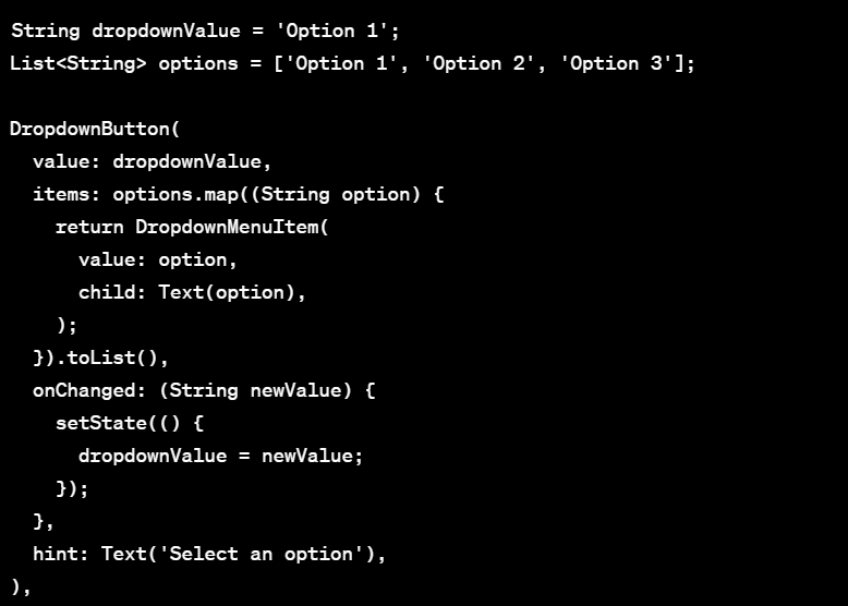
- The DropdownButton widget is a button that provides a dropdown menu of options. It's great for use in actions that require a selection from a list of options, such as choosing a language or currency.
Example usage:
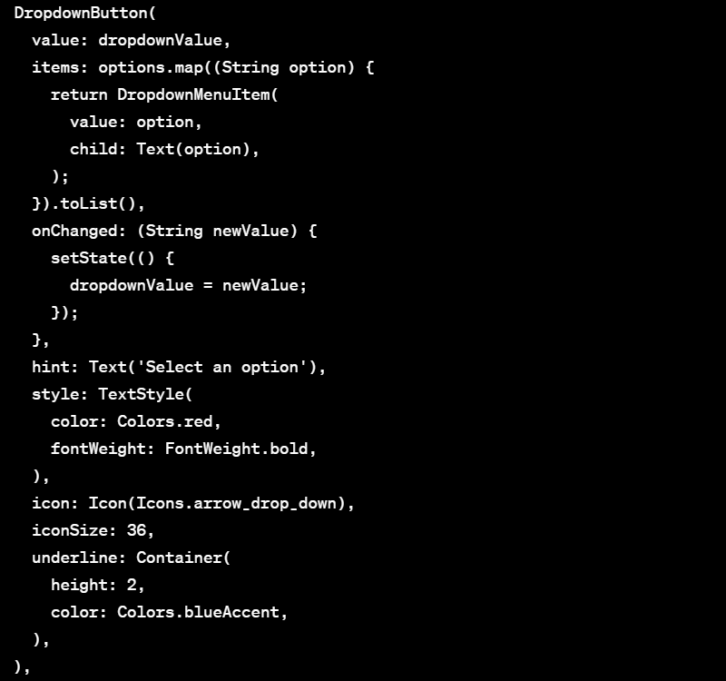
Customize the DropdownButton Style
- a DropdownButton will use the default button style provided by Material Design. However, we can customize the button style by passing a style object to the style argument.
DropdownButton with Index
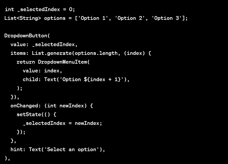
- DropdownButton widget displays the options as strings, but we can also display the options using indices.
Example usage:
Display the Selected Option
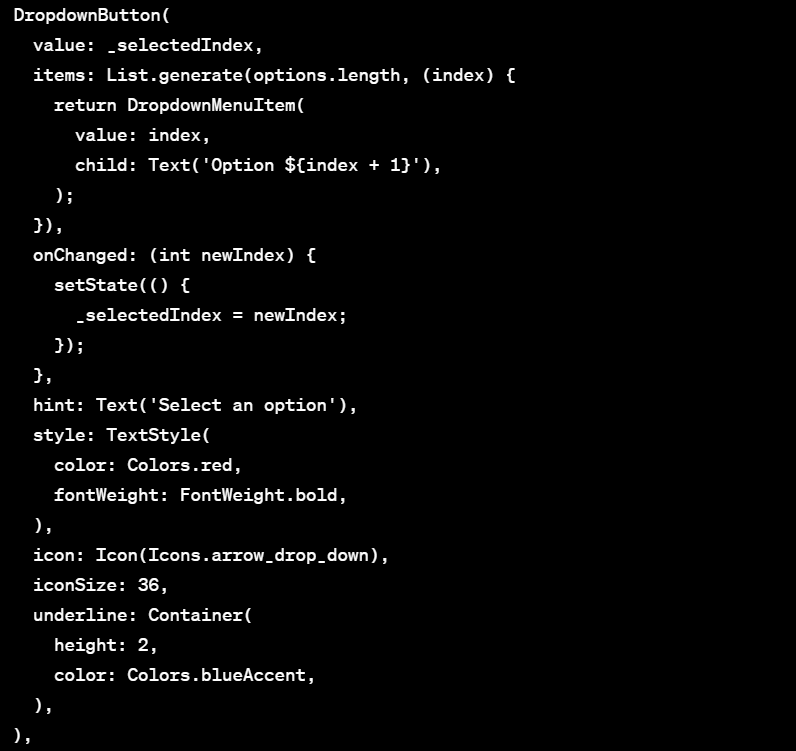
Customize the DropdownButton Style
- a DropdownButton will use the default button style provided by Material Design. However, we can customize the button style by passing a style object to the style argument.
7. Inkwell Button
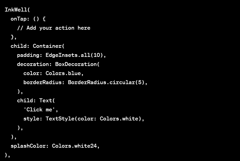
- In Flutter, InkWell is a Material Design widget that provides a visual touch effect on the user interface. It creates a rectangular area where the user can tap and interact with the widget. In this blog, we will go through how to create an InkWell button in Flutter with an example.
Example usage:

